| Home | Open Account | Help | 332 users online |
|
Member Login
Discussion
Media SharingHostingLibrarySite Info |
Nostalgia & History > Photoshop and old pixDate: 11/02/05 09:22 Photoshop and old pix Author: jbwest Back in 1961 I took this picture of a train leaving Antonito headed for Cumbres and Chama. Let's say the lighting combined with my primitive photography skills produced an rather dull image. Interesting subject, just really really dark.
Recently I worked on it using the "out of the shadows" tool that is part of the newer versions of Photoshop (the full tool is in CS, Elements has a somewhat simpler version). The next post shows the result. John West 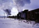 Date: 11/02/05 09:26 Re: Photoshop and old pix Author: jbwest This is the "new and improved" version. I'm curious as to what people think. I like it, but it looks more like a Norman Rockwell painting than a photograph. There is a bit too much magenta in it, but when I tried to reduce the magenta I started getting unacceptable "artifacts".....which probably means I still have a lot more to learn about Photoshop.
More ng. pix are available at: http://home.att.net/~jbwest/wsb/html/view.cgi-home.html-.html John 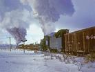 Date: 11/02/05 09:39 Re: Photoshop and old pix Author: IC_2024 jbwest Wrote:
------------------------------------------------------- > This is the "new and improved" version. I'm > curious as to what people think. I like it, but > it looks more like a Norman Rockwell painting than > a photograph. I agree, it really looks like a painting at this point. Trains featured an article during the Hemphill years which made someone's photos into Ted Rose-like paintings--very different, but a nice change I thought. Date: 11/02/05 09:39 Re: Photoshop and old pix Author: cozephyr Well done. It's a great improvement. I think you're onto something. Photoshop helps bring those so-so photos out of the "dark side" to fine images.
Date: 11/02/05 10:24 Re: Photoshop and old pix Author: J.Ferris jbwest Wrote:
------------------------------------------------------- > This is the "new and improved" version. I'm > curious as to what people think. I like it, but > it looks more like a Norman Rockwell painting than > a photograph. There is a bit too much magenta in > it, but when I tried to reduce the magenta I > started getting unacceptable "artifacts".....which > probably means I still have a lot more to learn > about Photoshop. > > More ng. pix are available at: > > http://home.att.net/~jbwest/wsb/html/view.cgi-home > .html-.html > > John John, Which version of the photo reflects what you actualy saw? Was it a dark dreary day or something brighter? That is what you are after. J. Date: 11/02/05 11:03 Re: Photoshop and old pix Author: NormSchultze The photoshopped version is far superior. A similar effect could have been achieved in a 'wet darkroom', using either a mask or dodging. But it IS better with electrons. No Stink, no really nasty chemicals....
Date: 11/02/05 11:56 Re: Photoshop and old pix Author: sphogger I will be different here, not that I don't appreciate your photoshop skills but I prefer the original. The first on really captures the cold winter mood with the darker tones. At first glance #1 looks like it could have been straight out of Ted Rose's "In The Traces" book.
The retouched version looks a bit too warm and maybe a bit overexposed? It sure does have a Norman Rockwell feel to it! sphogger Date: 11/02/05 13:13 Re: Photoshop and old pix Author: millerdc I like both of them. The original has a hard edge, cold reality to it. The Photoshop version is more artistic with a nostalgic mood.
Date: 11/02/05 13:56 Re: Photoshop and old pix Author: africansteam jbwest Wrote:
------------------------------------------------------- > This is the "new and improved" version. I'm > curious as to what people think. I like it, but > it looks more like a Norman Rockwell painting than > a photograph. There is a bit too much magenta in > it, but when I tried to reduce the magenta I > started getting unacceptable "artifacts".....which > probably means I still have a lot more to learn > about Photoshop. John, Photoshop's Shadow/Highlight was designed for situations such as this. What it does is preserve the bright areas while opening up the dark areas. In the case of this photo, it "saves" the bright section of the sky while pulling out the detail in the shadow areas. However, When it is used in the default setting it can "flatten" the image. Shadow/Highlight is a good starting point, but it needs to be tempered with careful application of its settings, and the other PS tools. Having said that, it looks like your default setting may have been altered, or you pushed the image a bit too far. In the case of this photo, I reccommend that you increase the midtone contrast, and ad a bit of "snap" using the shadow setting in the Levels panel. If necessary the magenta can be reduced using the Curves tool and/or the Color Balance tool. Here is the image using the following settings: Shadow/Highlight tool: Shadow Amount 50% (Default) Tonal Width 50% (Default) Radius 30px (Default) Highlights 0% (Default) Tonal Width 50% (Default) Radius 30px (Defaut) Color Correction +20 (Default) Midtone Contrased increased to +15 Levels Tool (Input): Black Point 12 (Up from zero) Midtones 1.20 (Up from 1.00) White point 255 (Default) Your preferences may vary! Cheers, Jack  Date: 11/02/05 16:41 Re: Photoshop and old pix Author: CimaScrambler One thing to try with photoshop
Bring up the image you want to process, it is on the "background" layer Take the original image on the background layer and copy it onto a new layer (Layer 1) Then apply whatever effect you want to the image in Layer 1. You can overdo the effect a bit here and still get away with it. Then finally adjust the opacity of Layer 1 so that some of the background layer shows through it. You can continuously adjust the opacity of layer 1 from 0% (background layer only shows) to 100% (Layer 1 only shows) to get just the amount that looks right of the effect you applied to layer 1. I do this all the time with sharpening to get just the right amount and prevent the grainy effect of oversharpening. It also works with contrast changes and color balance changes. When you are done, you can flatten the layers and save the image to a new file for futher processing using other effects. - Kit Date: 11/02/05 17:41 Thanks for the feedback..... Author: jbwest ...everytime I post something like this there is a lesson to learn or a new idea. I was particularly interested in the reaction to the warm color and painting like effect. I really like it, but clearly I took some artistic license with the original. The two "blue" versions are clearly much more in keeping with the original. I'm thinking of creating a collage of variations, since this picture seems to offer a lot of possibilities. This computer stuff is starting to spoil me, and getting into the smelly dark room to play with my B&W is becoming increasingly less frequent. Again, thanks for the feedback.
John West |