| Home | Open Account | Help | 331 users online |
|
Member Login
Discussion
Media SharingHostingLibrarySite Info |
Nostalgia & History > It's da BOMB!Date: 11/24/14 10:22 It's da BOMB! Author: hogheaded Last Saturday, Red put up a thread, "I Just Don't See the RR Writing Anymore…", in which I pontificated at some length to the notice of nobody.
Nevertheless, I'd like to offer my personal old codger's lament about what has gone wrong with the universe (Should you respond, however, please keep in mind that the subject of Jim Boyd was beaten to death in the aforementioned thread): >>>>>"I just don't see the art in RR design anymore…".<<<<< What I mean is, how can you look at an Amtrak P42 and not puke? F59's…YUCK! And the MPI MP36PH-3C boat anchors that plagued the latter part of my career? They look like suppositories! It wasn't like that in the '30's, '40's and '50's, by golly! Trains had style then! Who can't look at the Pre-War efforts of Kuhler, Dreyfus and Lowrey and Dreyfus and say they produced some remarkable mobile art? Raymond Lowrey's Pennsy Art Deco 6-4-4-6 and knife-nosed 4-4-4-4 prototype, in particular, were about as good as it ever got: Buck Rogers on wheels. Yes, they were mechanical duds, but we're talking style, here. After the war the sheet metal march towards the future continued a phrenetic pace, but got a little loopy in the early 1950's, perhaps due to the effects of radiation poisoning. The '50's were a curious time. We alternately cowered in bomb shelters whenever an air raid siren malfunctioned, and worshipped the wonderful promises of benign nuclear power - atomic-powered cars, airplanes, swizzle sticks and, of course, trains. Luckily, atom-powered trains never got off of the drawing board (see below). The thought of having a nuclear-powered loco, not to mention a large collection of swizzle sticks in the lounge car, blow to smithereens near one's backyard is a little unsettling. A multiplicity of other avant-garde designs of a more conventional nature also surfaced. It seemed that everyone had a 'concept' train up their sleeves. Some of them like the Aerotrain actually plied the rails, and were remarkable both for their artistic excellence and their poverty of practicality. Others, as with the atomic trains, only existed in artwork. Frank Kinsley drew some lulus (one shown below) for Mechanics Illustrated and Modern Mechanix (aside: Amtrak later apparently adopted Modern Mechanix's spelling conventions). To hype their wares, railroad suppliers, of such glamorous devices as fuel pumps, cylinder liners and Pullman poop shoots, hired advertising artists, who produced spectacular, drug-induced examples of art and impracticality. For some time and for no good reason I've been amassing examples of the Railroading-Gone-Wild design school, which although goofy, nevertheless stylistically beat the heck out of anything that has physically debuted on the rails in the 40 years (Where has our imagination gone?). Below are twelve random examples. >>>>>>Please add your own examples, as you see fit.<<<<<<< -E.O. Wx4.org - The Dome O' Foam 1) 1930's beyond Buck Rogers - would have made great pull-toys 2) The Zepplin as inspiration 3) Rocket train, 1950's 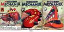 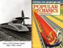 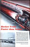 Date: 11/24/14 10:26 Re: It's da BOMB! Author: hogheaded 4) AAR goes atomic
5) Encapsulated atomic train 6) Atomic train plans 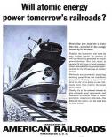 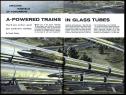 Date: 11/24/14 10:28 Re: It's da BOMB! Author: hogheaded 7) Kusan "Atomic Train" toy
8) "Atomic Train of the Future" toy 9) Santa Fe goes atomic, w / commentary from the Dome 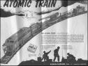 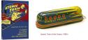 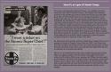 Date: 11/24/14 10:31 Re: It's da BOMB! Author: hogheaded 10) Ads of 1946 and 1953
11) Unknown wag’s Photoschlocked interpretation of what GM’s Aerotrain would have looked like had stylists literally adhered to inspiration. 12 This I Did Not Know Department: Fairbanks-Morse atomic locomotive (model CPA 240K-5?) 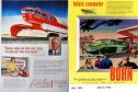   Date: 11/24/14 11:08 Re: It's da BOMB! Author: rswebber Design and art are in the eye of the beholder. Some examples - notably the aero-train look awful to me.
A lot has to do with form following function. Where collision posts, FRA mandated safety features, and common sense safety features are placed pretty much dictate outer skin. Now...I admit I think the current locomotives are ugly as sin. But you always think the things you grew up with were better looking. OTOH, I know damned well we didn't have girls in our high school that look like some of the 8th graders today do - or even, in some cases, in college! (good thing too, as intimidating as the ones we had were, no telling how I'd react) But you can add to the examples the Pullman Railplane, the Pullman Monorail system, and myriad other attempts at modernizing trains. Note that some things people love now - notably the original UP streamliners - were dead ends in so many ways. Their cross section was set to conform to airline shapes, not railroad shapes. The whole concept of what was streamlined was actually backassward from what REALLY counted in terms of airflow. In terms of writing...you can't publish what you don't have submitted. And...due to the nature of the beast, an editor is rarely now a writer. In the "good old days" you had to be good at both. No longer. Now editing is a full time requirement. And...when you look at the writing styles of on-line writers, you can see why. Date: 11/24/14 11:20 Re: It's da BOMB! Author: hogheaded >Some examples - notably the aero-train look awful to me.
Absolutely, but in relation to later monstrosities, they still look pretty good to me. You'll have a hard time arguing a crabby ex hoghead out of his (Why am I writing in the third person? It must be due to Internet contamination.) unassailable views of the universe. -E.O. Date: 11/24/14 12:48 Re: It's da BOMB! Author: MartyBernard WOW, thanks for digging out and posting all of this!
Marty Bernard Date: 11/24/14 14:29 Re: It's da BOMB! Author: 494 WOW x 2, very amusing content here...thanks for the submission hogheaded!
Date: 11/24/14 15:56 Re: It's da BOMB! Author: agentatascadero I remember this stuff from my kidhood....even back then, I thought it to be really Koo-koo. It all seemed to pretty much have nothing to do with actual railroading. AA
Stanford White Carmel Valley, CA Date: 11/24/14 16:37 Re: It's da BOMB! Author: Westbound The key word back then appeared to be "Atomic". Mix that term with the artist's airbrush and his imagination produced those interesting images you have shown here. Something similar occurred around 1956 with the word "transistor". Advertisers used the word any way they could, even "transistorized" electric cake mixers! We are all far too old to have been around when "steam" began making the news, but I wonder what odd ideas surfaced back then. Perhaps "steam punk" is just a hint of those times.
Date: 11/24/14 16:52 Re: It's da BOMB! Author: Ray_Murphy Some of these things were actually built and reasonably successful. I remember being impressed as a kid in the 1950s by a movie about a futuristic Italian train racing by Mt Vesuvius, which I now know was an FS Breda ETR 300 Settebello.
Ray Date: 11/24/14 18:08 Re: It's da BOMB! Author: bearease Not a whole lot different than the term, "HD" today. When advertisers get a hold on a keyword, they'll use it to death. High-def radio, High-def doppler radar, High-def pudding? Mmmmm, sounds good! (OK I made that last one up myself!)
Westbound Wrote: ------------------------------------------------------- > The key word back then appeared to be "Atomic". > Mix that term with the artist's airbrush and his > imagination produced those interesting images you > have shown here. Something similar occurred > around 1956 with the word "transistor". > Advertisers used the word any way they could, even > "transistorized" electric cake mixers! We are all > far too old to have been around when "steam" began > making the news, but I wonder what odd ideas > surfaced back then. Perhaps "steam punk" is just a > hint of those times. Date: 11/24/14 20:20 Re: It's da BOMB! Author: agentatascadero Westbound Wrote:
------------------------------------------------------- > The key word back then appeared to be "Atomic". > Mix that term with the artist's airbrush and his > imagination produced those interesting images you > have shown here. Something similar occurred > around 1956 with the word "transistor". > Advertisers used the word any way they could, even > "transistorized" electric cake mixers! We are all > far too old to have been around when "steam" began > making the news, but I wonder what odd ideas > surfaced back then. Perhaps "steam punk" is just a > hint of those times. "Atomic". At least folks could pronounce the word, as opposed to the more modern nuc-u-lar butchering of the actual word: nuclear. AA Stanford White Carmel Valley, CA Date: 11/24/14 22:11 Re: It's da BOMB! Author: DNRY122 Remember when the BART system was called "Space Age Rapid Transit"?
And there's one field in which nuclear power has been successfully used for transportation: Nuclear submarines and warships. When you don't have to worry about a "bottom line" and you do worry about refueling in hostile places, that's the way to go. How about a nuclear powered streetcar? I can think of a couple of railway museums in areas where the power grid is energized in part by nuclear generating stations. Date: 11/25/14 02:09 Re: It's da BOMB! Author: Evan_Werkema hogheaded Wrote:
> What I mean is, how can you look at an Amtrak P42 > and not puke? You close your eyes and listen! That sharp, crackling, snarling exhaust that actually changes when the train accelerates is such an auditory improvement over the F40's they replaced that I'm willing to give them a pass in the looks department (the F40 wasn't much of a looker, either). > F59's…YUCK! And the MPI MP36PH-3C > boat anchors that plagued the latter part of my > career? They look like suppositories! Cesar Vergara doesn't seem to like to design locomotives with defined noses below the windshield, preferring instead to make the front one continuous convex curve or angle. I suspect that's one reason why his designs tend to jangle nerves, since most "classic" US streamlined diesels had pronounced proboscises. The other reason of course is that his designs have the gall and audacity to be new, and anything new is automatically ugly, terrible, awful, and a sure sign of the coming apocalypse. > It wasn't like that in the '30's, '40's and '50's, > by golly! Trains had style then! Style with no qualifiers, yes. "Good" style? Sometimes, but that era produced its fair share of clunkers, head-scratchers, and wretch-inducers. "Inverted bathtub" designs (again, designs with no "nose" but just a straight drop to the pilot) tend to be particularly unappealing: http://www.northeast.railfan.net/images/up7002a.jpg Milwaukee Road, though, got it just right with their Hiawatha Class A 4-4-2's. Loewy criticized them for lacking a "steam-locomotive feel"...whatever: http://digital.denverlibrary.org/cdm/ref/collection/p15330coll22/id/48441 > Who can't look at > the Pre-War efforts of Kuhler, Even today, debate still rages as to whether Kuhler's Alco streamlined passenger diesels (DL-103/105/107/109) are good-looking locomotives or abominations: http://www.northeast.railfan.net/images/ri622.jpg > Dreyfus Henry Dreyfuss' NYC J3a Hudsons are perhaps the last word in Art Deco streamlined locomotive design, but, but... I can understand from a maintenance standpoint why it was desirable not to extend the skirting all the way forward and over the front cylinders, but it leaves the design looking unfinished: http://www.northeast.railfan.net/images/nyc5445.jpg > and Lowrey Who? Raymond Loewy seemed to go for the "Hapsburg" look, giving a lot of his locomotives over-exaggerated chins: http://www.northeast.railfan.net/images/tr_prr6100.jpg There is also considerable debate concerning the aesthetic merits of his original, square-windshield FM Erie-builts. Inexplicably, Loewy wanted that already long snout to be about nine feet longer! http://www.rr-fallenflags.org/kcs/kcs61am.jpg The later, straight-roof, teardrop windshield Eries were an improvement, IMHO: http://www.rr-fallenflags.org/kcs/kcs62am.jpg > and Dreyfus The only other Dreyfuss design I'm familiar with is the one applied to NYC 4-6-2's, another somewhat uncomfortably bloated-looking "inverted bathtub:" http://www.northeast.railfan.net/images/nyc4915.jpg > and say they produced some remarkable > mobile art? Indeed. "Art" isn't just "stuff I like," and it doesn't have to be good to be remarkable. > Raymond Lowrey's Pennsy Art Deco > 6-4-4-6 and knife-nosed 4-4-4-4 prototype, in > particular, were about as good as it ever got: > Buck Rogers on wheels. The T1's were another example of Loewy's fascination with preposterous chins. Age and oblivion have elevated them to "classic" status, but if this was a brand-new design (or heaven forbid, a foreign design), I guarantee it would be roundly criticized as hideously ugly: http://prrsteam.pennsyrr.com/images/prr5503.jpg Date: 11/25/14 10:39 Re: It's da BOMB! Author: hogheaded Evan_Werkema Wrote:
------------------------------------------------------- [at some length] ------ I believe that such a well thought out, and so generally misguided an answer deserves considered attention (-: First, due to the distractions of the NFL, I did not properly underscore the fact that what I was lamenting the lack of inspired RR design art since Sherman Adams was president. As with all art, it has its hits and misses, and I think that I did a pretty good job in describing the misses with my graphic presentation. But the thing is, even those misses generally are one heck of a lot more pleasing to the eye than a rolling suppository. Ultimately, as you allude to, most people (especially foamers - I don't think that you'll find many of us perusing the halls of the Uffizi or Tate Modern), subscribe to the school of, "I don't know anything about art, but I know what I like." I am of a mind that the present crop of RR design fails to offer offer that key ingredient - art - hence my lament, "I just don't see art in RR design anymore." Now, let's see where you have gone wrong: I said: >>What I mean is, how can you look at an Amtrak P42 and not puke? You said: >You close your eyes and listen! That sharp, crackling, snarling exhaust that actually changes >when the train accelerates is such an auditory improvement over the F40's they replaced that >I'm willing to give them a pass in the looks department (the F40 wasn't much of a looker, either). I say: Gad, man, I can close my eyes and listen to the delightful vocals of Ethyl Merman or Faye Ray (young readers: substitute Imogen Heap and Peaches), but I never saw their mugs splashed on the covers of any modeling magazines. Incidentally, I believe that Cesar Vergara's talents would be better served working for Bayer or Novartis, with the added bonus that this would tend to keep him out of the country. As for F40's, I opine they are descendent of FP45's and the times when things began to go seriously wrong - U30CG, TurboTrain. At least Santa Fe covered up their FP's with a gorgeous coat of paint derived of earlier sensibilities. What I like about F40's is that they are well-proportioned - squat and no nonsense, sort of like Winston Churchill. Pretty? No. "Style"? Hardly, but their looks connoted what the taxpayer was looking for in Amtrak, and underscored that they were mechanically well-suited to their purpose. How can you, or anyone like the P42? I just don't get it. They look like what God would have done if he had designed Wilt Chamberlin to fit through NEC tunnels: ponderous, ungainly and unnaturally sheared. They also look like what the taxpayers actually got in Amtrak, monocoque bodies that can't be repaired in the case of a mishap. You said: >Style with no qualifiers, yes. "Good" style? Sometimes, but that era produced its fair share of clunkers, >head-scratchers, and wretch-inducers. "Inverted bathtub" designs (again, designs with no "nose" >but just a straight drop to the pilot) tend to be particularly unappealing: ANY style! Art and style go hand-in-hand, and can be good, bad or indifferent. The trouble is that today's RR design attempts fall woefully short of art, or style. Curiously, today's gull wing freight monsters may not be art, but they do seem to have an unintended style about them that reminds me of steam locomotives. You said: >Milwaukee Road, though, got it just right with their Hiawatha Class A 4-4-2's. Loewy criticized >them for lacking a "steam-locomotive feel"...whatever: I say: At least we are in agreement here. Milwaukee's Class A's were beauts! Loewy's criticism was merely a product of rivalry. You said: >Even today, debate still rages as to whether Kuhler's Alco streamlined passenger diesels (DL-103/105/107/109) are good-looking locomotives or abominations: I say: The DL's were a classic case of, "I know what I like." I think that they are butt ugly, but they nevertheless comprise the backbone of my toy train passenger locomotive fleet. Re Kuhler, he was the best of his contemporaries when it came to working with what he had, the NYO&W Mountaineer and his minimalist redesign of the Alco HH's, for example. Dreyfuss and Loewy would have rather designed spittoons than be caught at such modest activities. You said: >Henry Dreyfuss' NYC J3a Hudsons are perhaps the last word in Art Deco streamlined locomotive design I say: HA! See below. You said: >Raymond Loewy seemed to go for the "Hapsburg" look, giving a lot of his locomotives over-exaggerated chins: and: >There is also considerable debate concerning the aesthetic merits of his original, square-windshield FM Erie-builts. >Inexplicably, Loewy wanted that already long snout to be about nine feet longer! and: >The T1's were another example of Loewy's fascination with preposterous chins. Age and oblivion have elevated >them to "classic" status, but if this was a brand-new design (or heaven forbid, a foreign design), I guarantee it >would be roundly criticized as hideously ugly: I say: I'm a real rube when it comes to explaining the subtleties of an artist/stylist's intentions, but what clobbers me over the head is that Loewy was trying to project a feeling of speed and forward progress that would be evident even in publicity stills. This, he did. Dreyfuss' J3a indeed was a work of genius, but the locomotive itself was dimensionally run-of-the-mill. In Pennsy's 6-4-4-6 and 4-4-4-4, Loewy had canvasses whose staggering size he accentuated with those "Hapsburg" prows. The later Pennsy Duplexes look noseless and brutish by comparison. To me, in terms of total effect, they surpass any locomotives that have ever been rendered. In regard to the shark nose of the T1, it surely did not match the beauty of the S1, but it nevertheless gave a like feeling of power. I'm sure that it would indeed be lambasted as "hideously ugly" by those same people who think that our contemporary suppositories and shoeboxes are the epitome of beauty. And besides, I'm married to a German descendent and personally like the Hapsburg Nose. Hopefully, if I have not caused you to adopt my unassailable logic, I have have nevertheless worn you down into submission. Again, it is the absence of design art and style present in today's locomotives that bothers me, not whether olden efforts were good, or bad. My grandson could do a better job with a hunk of Play Dough. -E.O. My hero: 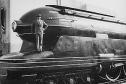 Date: 11/25/14 22:53 Re: It's da BOMB! Author: Xtra276West hogheaded Wrote:
------------------------------------------------------- > Evan_Werkema Wrote: > -------------------------------------------------- > > Now, let's see where you have gone wrong: > > I said: > >>What I mean is, how can you look at an Amtrak > P42 and not puke? > > You said: > >You close your eyes and listen! That sharp, > crackling, snarling exhaust that actually changes > >when the train accelerates is such an auditory > improvement over the F40's they replaced that > >I'm willing to give them a pass in the looks > department (the F40 wasn't much of a looker, > either). > > I say: > Gad, man, I can close my eyes and listen to the > delightful vocals of Ethyl Merman > -E.O. ETHEL Merman's voice could IGNITE 'Ethyl' (gasoline) :p Pat from Littleton, CO. Date: 11/26/14 06:20 Re: It's da BOMB! Author: hogheaded Xtra276West Wrote:
------------------------------------------------------- > hogheaded Wrote: > -------------------------------------------------- > ----- > > Evan_Werkema Wrote: > > > -------------------------------------------------- > > > > Now, let's see where you have gone wrong: > > > > I said: > > >>What I mean is, how can you look at an Amtrak > > P42 and not puke? > > > > You said: > > >You close your eyes and listen! That sharp, > > crackling, snarling exhaust that actually > changes > > >when the train accelerates is such an auditory > > improvement over the F40's they replaced that > > >I'm willing to give them a pass in the looks > > department (the F40 wasn't much of a looker, > > either). > > > > I say: > > Gad, man, I can close my eyes and listen to the > > delightful vocals of Ethyl Merman > > > -E.O. > > ETHEL Merman's voice could IGNITE 'Ethyl' > (gasoline) :p > > Pat from Littleton, CO. Boy, you got that right!!! Note that I said "delightful", not pretty. -E.O. Date: 11/26/14 06:37 Re: It's da BOMB! Author: hogheaded Upon reflection about my long-winded (Hey, it's a gift) repartee to Evan's repartee (third above) to my original long-winded post:
Though I've received no personal feedback from anyone, one way, or another, I judge that I was short on praise for his thoughts and effort. I want to make it plain that his ideas were inspirational (the length of my rejoinder should infer such). I plodded through my answers to with a smile and a laugh, and that may have not been evident. -E.O. Date: 11/26/14 07:19 Re: It's da BOMB! Author: Evan_Werkema hogheaded wrote:
> Though I've received no personal feedback from anyone Awk-scrEEEEEEEE!!! > I judge that I was short on praise for his thoughts and effort. I want to make it plain that his ideas were inspirational Aw shucks, yer makin' me blush! > I plodded through my answers to with a smile and a laugh, and that may have not been evident. Likewise. I couldn't help but wonder if Unleaded Merman might have been easier on the ears. > ANY style! Art and style go hand-in-hand, and can > be good, bad or indifferent. The trouble is that > today's RR design attempts fall woefully short of > art, or style. One more semi-serious comment on this point. Say what you will about the F59PHI, but they represent one of precious few attempts since the demise of E-units to build locomotives whose contours actually match the cars they pull. Yeah, an F59PHI on lozenges or Talgos looks silly, because all that extra skyline casing was designed to make the units match California Cars. Put an Amtrak California F59PHI on a matching string of California Cars, all wearing that subtle but attractive paint scheme that actually works WITH the contours of the locomotive instead of against them (unlike Sounder's WWI-era, submarine-defeating dazzle camouflage or Metrolink's big blue spring-cushion cab, etc.) and I'd argue you have a modern package that includes a dash of that ever elusive "style" you're seeking. "Good" style? Well, here we go again... |