| Home | Open Account | Help | 273 users online |
|
Member Login
Discussion
Media SharingHostingLibrarySite Info |
Nostalgia & History > Nevada Northern Switchlist from 1910Date: 02/23/17 18:36 Nevada Northern Switchlist from 1910 Author: NVNRy93 While on the photoshoot train, I spotted this old switchlist hanging in the caboose. I'm currently working on a Nevada Northern model railroad, and I am trying to reproduce this for it. I can't seem to find the correct fonts and was wondering if yall could help me out. Thank you.
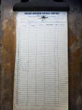 Date: 02/23/17 19:26 Re: Nevada Northern Switchlist from 1910 Author: SCKP187 the smaller type column headings are most likely #2 or #3 Gothic a Merganthaler or American Type Founders font
the bold top line is some font of Bold Condensed Helvetica? Spartan? One thing to remember--when this form was type set, all the fancy and goofy electronic type faces we have today hadn't even been dreamed of yet, so with today's electronic fonts available you may be able to get real close but not exact. Brian Stevens Date: 02/23/17 20:02 Re: Nevada Northern Switchlist from 1910 Author: zephyrus Of course when this was printed it was typeset and many of the fonts as we know them today did not exist. Its hard to see some of the nuances from the photo, but I think I can give you a couple that would look close.
The "NEVADA NORTHERN" text on the type reminds me of Impact, which is a bold, vertical sans serif font. A helvetica variant might also work. A good match for the other heading text would be either Blue Highway or Swiss721. Note that the text on the switchlist looks a little elongated horizontally to me, so maybe stretch the text about 20-25%. The numbers are a Roman font, probably bold or slightly bold. You could use Railroad Roman, but that font is somewhat exaggerated and elongated. A regular Roman would be a closer match. Hope this helps! Z Edited 1 time(s). Last edit at 02/23/17 20:03 by zephyrus. Date: 02/23/17 23:08 Re: Nevada Northern Switchlist from 1910 Author: wattslocal I'd take a guess that the small headings are Copperplate Gothic No. 2 & 3 sizes. Lots of that tabular work was done on Monotype machines.
Watts local Date: 02/24/17 16:27 Re: Nevada Northern Switchlist from 1910 Author: DrLoco the other posters are bang on, with Impact and Copperplate for the top headers and some kind of roman font for the numbers.
I would also mention that while you may find a version of Helvetica that might be close, it was not invented as a typeface until 1957, and had not found everyday use until the mid 60's to current day. |