| Home | Open Account | Help | 323 users online |
|
Member Login
Discussion
Media SharingHostingLibrarySite Info |
Passenger Trains > Missing from the first four ViewlinersDate: 12/17/14 18:20 Missing from the first four Viewliners Author: PCCRNSEngr Missing from the cars is the Pointless Arrow
1.Baggage 61010 Today departing CAF Elmira, NY 2.Sleeper Portage River taken back in July. Elmira, NY 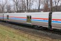 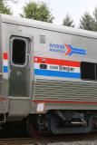 Date: 12/18/14 02:42 Re: Missing from the first four Viewliners Author: andersonb109 So is there a plan to re-paint (again) the older single level equipment? Otherwise, as the new and old are mixed together as no doubt they will be, the trains won't match. Not a huge deal but just wondering why they went back to the older paint scheme in the first place...or better yet, why they went away from it! Corporate identity is important. Other than the occasional special paint job, you don't see airlines with a variety of logos or paint schemes. Come to think of it, many Amtrak stations away from the NEC still have the pointless arrow as their signage. The cost to change all those logos and passenger cars in the first place would have probably been enough to keep the table cloths and flowers in the diners!
Date: 12/18/14 03:04 Re: Missing from the first four Viewliners Author: hazegray The old three stripe paint scheme was -- and is -- very easy for mechanical forces to maintain.
Date: 12/18/14 09:41 Re: Missing from the first four Viewliners Author: hsr_fan The Viewliners look so much sharper in Phase IV imo. The Phase III is really gonna ruin the look of the otherwise upgraded trains. See diner 8400 and the new theater car conversion - why is Amtrak so confused and inconsistent on color scheme?
Date: 12/18/14 09:48 Re: Missing from the first four Viewliners Author: knotch8 Because they can't decide whether to railroad or be railfans. I'm sure they'll say they can do both.
The pointless arrow is pointless. It's a past brand, and it was replaced by the "three waves." Whatever we may all think of that brand, the fact is that it's Amtrak brand, and I've never understood why Amtrak starting putting the pointless arrow on the side of the Beech Grove business car and the various executive sleepers they've operated recently. Unless someone's just railfanning. It sends the wrong message to everyone who sees the pointless arrow on the cars. I'm glad to see the new Viewliner baggage cars with the "three waves." As much as I liked the Phase 3 paint scheme, I don't understand the return to it, unless all long-distance equipment is going to be restriped in it. That would be fine, if it's thorough and consistent. The only problem will be with trains such as the Pennsylvanian and Palmetto, which operate with a mix of long-distance and Amfleet-I NEC cars. Well, and the baggage car on Trains 66/67 will have different stripes from the rest of the train. I also don't understand why the car numbers and name (Baggage) are different sizes. It looks uneven, disjointed and amateurish. Date: 12/18/14 10:12 Re: Missing from the first four Viewliners Author: coach Notice that some of the coil springs in the trucks are painted, or coated, red! Red coil springs--you don't see that every day.
Date: 12/18/14 10:16 Re: Missing from the first four Viewliners Author: knotch8 Good eye. Looks sharp!
Date: 12/18/14 13:58 Re: Missing from the first four Viewliners Author: Jishnu coach Wrote:
------------------------------------------------------- > Notice that some of the coil springs in the trucks > are painted, or coated, red! Red coil > springs--you don't see that every day. The coil springs used in baggage cars or the baggage end of the bag dorms ae re supposed to be different from the ones in passenger cars. To make the difference clearly visible they are painted red - or so I was told by someone who has been involved in the project. Date: 12/18/14 20:22 Re: Missing from the first four Viewliners Author: Mgoldman Brand identity is not important when you are the ONLY brand.
I'm OK with and prefer the "3 waves", or is it a train pushing through air, logo. It does seem a bit odd to go back to a logo that was never really well revered. Maybe if they put a point on it, lol. Question is - why both logos on new cars? Or is it one logo on some new cars and the other on other new cars? /Mitch Date: 12/20/14 06:16 Re: Missing from the first four Viewliners Author: RutledgeRadio I like the return of Phase III. Hope they repaint the whole fleet in it. I also like the "three sheets" logo being put on most of the newer cars. Though I don't understand this "Amtrak America" branding. What exactly does that mean?
Probably one of the reasons Amtrak put the pointless arrow on the first few cars is because of the heritage craze that's going on right now. At least on the railroads, it's the cool thing to go back to a "retro" logo or paint scheme. Just look at Florida East Coast, or KCS. Not including all of the heritage engines on the UP, NS, IAIS, and Amtrak. It's probably a way for Amtrak to protect/honor their past image, and I don't have a problem with that! As for mis-matched consists, that's nothing new. You almost NEVER see an Amtrak train with the exact same paint scheme on all the engines and cars. I'm not sure I have since the Phase III days, and even then some of the newer Phase IV Superliners were starting to trickle through. I'm not sure the public really notices or cares much. It's just a train to them. |