| Home | Open Account | Help | 240 users online |
|
Member Login
Discussion
Media SharingHostingLibrarySite Info |
Eastern Railroad Discussion > What's this on the FEC?Date: 08/17/19 13:38 What's this on the FEC? Author: RRBMail On a recent tour of Florida East Coast's Jacksonville facility I spotted this nose peering out of a shed. Anyone know anything about it? Thanks in advance.
 Date: 08/17/19 14:01 Re: What's this on the FEC? Author: RFandPFan It is their new logo.
Date: 08/17/19 14:07 Re: What's this on the FEC? Author: ts1457 RFandPFan Wrote:
------------------------------------------------------- > It is their new logo. Yep: https://fecrwy.com/ I won't tell you my opinion. Date: 08/17/19 16:07 Re: What's this on the FEC? Author: wabash2800 Gosh. Let's hope some advertising agency didn't get paid a lot of money for that... Or maybe someone's spouse came up with it...
Victor A. Baird http://www.erstwhilepublications.com Date: 08/17/19 16:37 Re: What's this on the FEC? Author: ctillnc Easy to reproduce and scales down nicely to fit on a mobile screen. The trend is irrestible at present.
Date: 08/17/19 16:44 Re: What's this on the FEC? Author: flarails882 Image if Coke or Pepsi did a complete remake of their famous logos.
Date: 08/17/19 17:25 Re: What's this on the FEC? Author: CSX602 Remember, snowflakes don't like the thought of hurricanes...
Otherwise, just think of it as a good example of the common sense exodus.... PS. Coke and Pepsi have changed their logos, just gradually and/or keeping the same colors and style... (Like when Coca-cola was script, then just shortened to Coke - some 40 years before today's snowflakes that aren't taught and most can't read script/cursive/connected writing) Edited 3 time(s). Last edit at 08/17/19 17:34 by CSX602. Date: 08/17/19 17:49 Re: What's this on the FEC? Author: tomstp Just ugly.
Date: 08/17/19 22:27 Re: What's this on the FEC? Author: highgreengraphics After their high of the Heritage-painted units, here comes the low! === === = === JLH
Date: 08/18/19 11:08 Re: What's this on the FEC? Author: EL-SD45-3632 tomstp Wrote:
------------------------------------------------------- > Just ugly. How can you judge the whole unit by just the nose??? Date: 08/18/19 14:21 Re: What's this on the FEC? Author: CSX602 Because there are photos out there showing the sides which have gen-X-run-amuck teal and white stripes, http://www.rrpicturearchives.net/showPicture.aspx?id=5146527 , the (IMHO) idiotic new logo without formed lettering (other than the C which I guess they were smart enough to realize couldn't be done with lines), and it seems like even FEC realizes it isn't liked as well as past schemes (including the most recent heritage scheme) so they are keeping it hidden in the shop. The new scheme had been unveiled (on units 412 and 414) in May or June yet there are so few photos of it... Frankly IMHO the new scheme would be a lot better with the hurricane logo instead of that new logo.
In my opinion the #414 looked better in the 1990s scheme: http://www.rrpicturearchives.net/showPicture.aspx?id=1495634 ... the 2000's modified scheme: http://www.rrpicturearchives.net/showPicture.aspx?id=2915689 http://www.rrpicturearchives.net/showPicture.aspx?id=888353 or even its original scheme: http://www.rrpicturearchives.net/showPicture.aspx?id=1773742 and the new scheme isn't as good as the Heritage scheme it could have received... http://www.rrpicturearchives.net/showPicture.aspx?id=2928661 Edited 3 time(s). Last edit at 08/18/19 14:34 by CSX602. Date: 08/18/19 15:44 Re: What's this on the FEC? Author: The-late-EMD And how much money did you guys chip in?
Posted from Android Date: 08/18/19 16:07 Re: What's this on the FEC? Author: CZ10 And I thought they could never come up with a worse logo than the "circle".
My favorite is still the old Key West Extension logo. 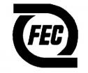 Date: 08/18/19 16:40 Re: What's this on the FEC? Author: Lackawanna484 Speedway to Sunshine has a nice ring to it, as well
Edited 1 time(s). Last edit at 08/18/19 18:13 by Lackawanna484. Date: 08/18/19 17:39 Re: What's this on the FEC? Author: wabash2800 Well, IMO, the rest of the unit, judging by No. 412, is just as bad or worse. What are those lines at the bottom of the carbody??? Aqua for the ocean? And why would you put "Railway" in smaller letters and in a different font below the roadname? They didn't legalize pot in Florida yet.
Why would you economize with black paint and than add colors? Before you flame me, I'm entitled to my opinion just like everyone else here. I can't wait to hear the nicknames for this paint scheme. Victor A. Baird http://www.erstwhilepublications.com EL-SD45-3632 Wrote: ------------------------------------------------------- > tomstp Wrote: > -------------------------------------------------- > ----- > > Just ugly. > > How can you judge the whole unit by just the > nose??? Edited 3 time(s). Last edit at 08/18/19 17:52 by wabash2800. Date: 08/18/19 18:15 Re: What's this on the FEC? Author: Lackawanna484 The Grupo Mexico name is now on the ES44 units. Next to the number, in a very nice script.
I'll post a picture tomorrow. Date: 08/18/19 21:35 Re: What's this on the FEC? Author: Mgoldman flarails882 Wrote:
------------------------------------------------------- > Image if Coke or Pepsi did a complete remake of > their famous logos. Don't have to imagine - they did. And I need not "chip in" on the redesign of a logo to agree - it's not all that impressive... at least, not in my opinion. Might work - if the locomtive was not painted mostly all black! Funny thing - the old logo looked like a symbol for a hurricane. Don't see much of a logo on any other time periods, other then the font used for the name. Looking at pics on RP.net - search "Florida East Coast", looks like many (all?) of their steam locomotives went without a logo. Attached - a photo from Railpictures.net from a photographer named Jason Osborn. /Mitch    Date: 08/19/19 06:26 Re: What's this on the FEC? Author: P Black is a better locomotive paint color than some of the orange schemes out there, but in Florida??
I did like the simple blue scheme with the hurricane logo. It was classic. Posted from Android Date: 08/19/19 07:04 Re: What's this on the FEC? Author: Lackawanna484 P Wrote:
------------------------------------------------------- > Black is a better locomotive paint color than some > of the orange schemes out there, but in Florida?? > > I did like the simple blue scheme with the > hurricane logo. It was classic. > > Posted from Android Yes. FEC experimented with several shades of blue over the years. And, white roofs on the GP40 units. The blistering sun can really rip up a dark color. Date: 08/19/19 09:25 Re: What's this on the FEC? Author: flarails882 Mgoldman Wrote:
------------------------------------------------------- > flarails882 Wrote: > -------------------------------------------------- > ----- > > Image if Coke or Pepsi did a complete remake of > > their famous logos. > > Don't have to imagine - they did. > > And I need not "chip in" on the redesign of a logo > to > agree - it's not all that impressive... at least, > not in > my opinion. Might work - if the locomtive was > not > painted mostly all black! > > Funny thing - the old logo looked like a symbol > for a > hurricane. Don't see much of a logo on any > other > time periods, other then the font used for the > name. > > Looking at pics on RP.net - search "Florida East > Coast", > looks like many (all?) of their steam locomotives > went > without a logo. > > Attached - a photo from Railpictures.net from a > photographer named Jason Osborn. > > /Mitch I liked the old Pepsi logo and the newer version just as much. It is not a complete redesign. The Coke is the same way. Ribbon on red background. I guess at the time Corporate America was shorting the names. In this case Coca-cola to Coke. (and back). So they were not the only ones shortening the name. UPS has had versions of the shield for decades. Different yes, but then again no dramatic overnight redesign. CSX to [CSX]!. Don't expect a nice reaction when you replace a good historic logo and replace it with a design that cost 10 cents. This logo is so porous I though Groupo Mexico sold off the FEC, and it's new owners put their "C" logo on a unit for show! |