| Home | Open Account | Help | 374 users online |
|
Member Login
Discussion
Media SharingHostingLibrarySite Info |
Nostalgia & History > New "Signal Sunday" backgroud "test drive".....Date: 03/01/15 10:59 New "Signal Sunday" backgroud "test drive"..... Author: ATSF100WEST New image background "test drive" - (your mileage may vary).
Next, a vertical equivalent... Bob ATSF100WEST......Out 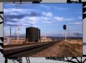 Date: 03/01/15 12:09 Re: New "Signal Sunday" backgroud "test drive"..... Author: GRNDMND Background looks good to me Bob and the photo is fabulous! Nice work all around.
KC Date: 03/01/15 12:18 Re: New "Signal Sunday" backgroud "test drive"..... Author: LarryDoyle IMHO it distracts from the primary image.
Sorry. -John Date: 03/01/15 12:42 Re: New "Signal Sunday" backgroud "test drive"..... Author: Gateway97 Such classic signals and a beautiful photo. I am a huge fan of your photography. I have to say that while your railroad color borders were and are stellar, this one doesn't accentuate the image. It seems distracting. This is one man's humble opinion. Your previous borders made your photos pop, even though they were already superb and can well stand on their own merits even without borders.
Date: 03/01/15 13:39 Re: New "Signal Sunday" backgroud "test drive"..... Author: crackerjackhoghead LarryDoyle Wrote:
------------------------------------------------------- > IMHO it distracts from the primary image. > > Sorry. > > -John Nice idea but, I too, find it distracting. Date: 03/01/15 14:28 Re: New "Signal Sunday" backgroud "test drive"..... Author: Out_Of_Service crackerjackhoghead Wrote:
------------------------------------------------------- > LarryDoyle Wrote: > -------------------------------------------------- > ----- > > IMHO it distracts from the primary image. > > > > Sorry. > > > > -John > > > Nice idea but, I too, find it distracting. i concur ... very distracting ... takes the eyes to all 4 sides of the border instead of going to the central focal point ... Posted from Android Date: 03/01/15 14:39 Re: New "Signal Sunday" backgroud "test drive"..... Author: ATSF100WEST OK, Thanks, guys - I appreciate your input! I have an idea that might improve the "distraction" of the contrast.
Watch this space... ;^) Bob ATSF100WEST......Out Date: 03/01/15 17:47 Re: New "Signal Sunday" backgroud "test drive"..... Author: turbine To me Bob it's the part where the lettering is. It is hard to read your caption at the bottom due to the border.
Larry Date: 03/01/15 19:47 Re: New "Signal Sunday" backgroud "test drive"..... Author: SCKP187 Nice image. I like the border--just needs something to help the type.
Brian Stevens Date: 03/02/15 04:09 Re: New "Signal Sunday" backgroud "test drive"..... Author: acltrainman The signal border doesn't do anything for the shot. Distracting to say the least. Just my opinion.
Stanley Jackowski Valrico, FL Date: 03/02/15 09:43 Re: New "Signal Sunday" backgroud "test drive"..... Author: ATSF100WEST Here is "version II" - a definite improvement, but would like your thoughts.
I will re-post this next Sunday with a link back here, so that all who were kind enough to reply might see it again. Thanks again, everyone! Bob ATSF100WEST......Out 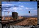 Date: 03/02/15 09:52 Re: New "Signal Sunday" backgroud "test drive"..... Author: jimB Bob, on almost all your photos, I really like the backgrounds, and of course the photos are excellent.
In that one, for whatever reason, it's a little much. That said, I really enjoy you postings and photos. Jim B Date: 03/02/15 20:33 Re: New "Signal Sunday" backgroud "test drive"..... Author: railstiesballast In my opinion the second example, with less contrast, retains interest but makes the primary image stand out and makes the text much more legible.
Date: 03/03/15 00:18 Re: New "Signal Sunday" backgroud "test drive"..... Author: lwilton Usually I quite like your frames, but like others, I found this frame distracting. I decided to try to figure out why.
I pasted the image into Photoshop, and immediately noticed that the frame was NOT distracting! What was the difference? TO has a white background outside the frame, and PS has a medium grey background, darker than the frame. It seems that part of the distraction comes from the contrast from outside-frame-inside. Both the outside and the inside (the image) are lighter than the frame, and the frame seems to be a distracting dark bar or line that pulls the eyes. Or at least my eyes. I then built a big white border around the frame in PS, and sure enough, the frame got distracting again. So I started experimenting with various colors and hues to see what seemed to be distracting and what wasn't. In summary, it seems that frames that have about the same value as the average image brightness are a good choice. They can be a little brighter or darker than the average image to stand out, but not greatly brighter or darker or they draw the eye away from the image. The hue can either be similar to the image background or semi-complementary. Violets and orangy-whites with about +94 saturation and +70 lightness work well, but the text is hard to read since there is little contrast with the background. Dropping the lightness down to +28 to make the text easier to read, the best colors for this image again seemed to be the mauve-violets and a distinctly blue-grey color, rather than a neutral grey. Going to a fairly dark border (very slightly darker than the upper right sky) I could use almost any color, *except* a neutral grey! So it looks like (at least for my eyes) the trick is to more or less match the predominant light value or a little darker, and to use most any color except neutral grey. I don't understand why the greys don't seem to work, but at least for my eyes they don't work very well. I don't know that I understand why some stuff works and some other stuff doesn't, and I make no guarantees that other people see the way I do, but maybe some of that will be a help. Date: 03/03/15 08:14 Re: New "Signal Sunday" backgroud "test drive"..... Author: ButteStBrakeman Sorry, Bob, but it's a no for me. Sometimes change is NOT good, I like the original.
V SLOCONDR |