| Home | Open Account | Help | 370 users online |
|
Member Login
Discussion
Media SharingHostingLibrarySite Info |
Western Railroad Discussion > RI E6 #630 sneak peekDate: 03/25/17 20:35 RI E6 #630 sneak peek Author: bnsfsd70 :::peek a boo::: RI 630, adorning her fresh coat of maroon and silver has been parked in this spot outside of Mid-America Car in Kansas City for the past week. It sure looks to be fairly well finished, so it will likely hit the road shortly.
The 652 has been done for a while, but this one had been inside for quite a while. I can't wait! - Jeff Carlson 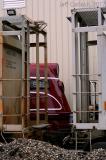 Date: 03/25/17 20:36 Re: RI E6 #630 sneak peek Author: bnsfsd70 For those of you who haven't seen the RI 652 since it was redone, here she is earlier this month.
- Jeff Carlson  Date: 03/25/17 21:02 Re: RI E6 #630 sneak peek Author: rrman6 Nice to see #652 here but still think they could have slightly spaced more between the ROCK and ISLAND lettering. I had to take a second look to assure myself this wasn't a HO Proto 2000 Walthers model. Hate to see the 652 and the 630 both leave Kansas but know Dan Sabin will have a better resting spot for them under his care in Iowa. At least their not headed for the "bone pile" like so many other RI units have met their demise.
Date: 03/25/17 21:39 Re: RI E6 #630 sneak peek Author: doge_of_pocopson Gosh they look good!
Date: 03/25/17 22:20 Re: RI E6 #630 sneak peek Author: MojaveBill That spacing may look that way due to the long lens....
Bill Deaver Tehachapi, CA Date: 03/26/17 02:38 Re: RI E6 #630 sneak peek Author: Hookdragkick Elegant! I love the Rock Island typeface. Does anybody know the name?
Posted from Android Date: 03/26/17 04:05 Re: RI E6 #630 sneak peek Author: jointauthority You can buy a font version of it at railfonts.com
Posted from Android Date: 03/26/17 06:29 Re: RI E6 #630 sneak peek Author: The_Chief_Way There is NO spacing on that unit between "Rock" and " Island."
Perhaps it will be corrected in Iowa. Date: 03/26/17 09:21 Re: RI E6 #630 sneak peek Author: bnsfsd70 Absolutely agree!
- Jeff doge_of_pocopson Wrote: ------------------------------------------------------- > Gosh they look good! Posted from iPhone Date: 03/26/17 09:25 Re: RI E6 #630 sneak peek Author: bnsfsd70 Nah, the 652 doesn't have much of any spacing between the two words, but honestly, I can overlook this, esp. considering the other changes they made to its paint. Don't like it? I'm sure that they're still accepting donations up in Manly, IA.
- Jeff Carlson MojaveBill Wrote: ------------------------------------------------------- > That spacing may look that way due to the long > lens.... Posted from iPhone Date: 03/26/17 19:12 Re: RI E6 #630 sneak peek Author: atsf121 Wow!
Posted from iPhone Date: 03/26/17 20:28 Re: RI E6 #630 sneak peek Author: rrman6 Will it get its horns and RI nose emblem back after arrival in Iowa?
Date: 03/26/17 21:35 Re: RI E6 #630 sneak peek Author: wpjones I was told the Emblem off the 630 dissapeared after it was pick up from the Junction with the Baldwin RR. Hopefully Sabins have it. This was the Emblem that Lynn Nystrom had and donated to the orriginal restoration.
Steve rrman6 Wrote: ------------------------------------------------------- > Will it get its horns and RI nose emblem back > after arrival in Iowa? Date: 03/27/17 08:31 Re: RI E6 #630 sneak peek Author: dan think i saw a pic with lettering redone
Date: 03/27/17 09:57 Re: RI E6 #630 sneak peek Author: Carondelet Hookdragkick Wrote:
------------------------------------------------------- > Elegant! I love the Rock Island typeface. Does > anybody know the name? > > Posted from Android California Zephyr/Burlington and Florida East Coast all used a very similar typeface, sometimes referred to simply as "Budd" lettering Date: 04/07/17 14:06 Re: RI E6 #630 sneak peek Author: flippin77 Ran both of these out of 47th St in Chicago. They didn't look this good in the mid 70's to the end of the CRI&P.
R Seaton |