| Home | Open Account | Help | 226 users online |
|
Member Login
Discussion
Media SharingHostingLibrarySite Info |
Model Railroading > BN(SF) 40’ COIL CARe car (Part 12) – NSC LogoDate: 07/31/22 23:58 BN(SF) 40’ COIL CARe car (Part 12) – NSC Logo Author: tmotor This is Part 12 of a series on the BN(SF) COIL CARe car. (Parts 1 thru 11 were posted earlier.)
The COIL CARe cars were built by the National Steel Car plant in Hamilton, Ontario (Canada). Ideally, the images of the NSC Logo would be tack sharp and render a clean Trace Bitmap to use as a large graphic. However, the outline was a bit blurry from the faded paint. This resulted in the Trace Bitmap function creating jagged lines as it tried to follow the threshold between light and dark. The result was an outline that resembled a mountain range. Bezier Curves As you know, graphics folks like Vector (line) drawings vs. pixels (dots). Their favorite tool is the Bezier Curve. (Pronounced “BEH-zee-ay”. Named after the French engineer that first developed the concept.) They are drawn around images to outline the pool of each color, like a high-tech coloring book. Once they are understood, they are quite useful. There are Nodes (shown as squares) along the curve. These are anchor points that the line must pass thru. The Nodes can be moved around by dragging with the mouse. They can be deleted, or more can be added. The trick is to use as few Nodes as possible to define the path. One method of modifying the zigzag results from the Trace Bitmap is to simply remove a few Nodes. Without the constraints of the unwanted Nodes, the line is free to move around, and generally will straighten itself between the adjacent Nodes. Nodes and Noodles Once the Nodes are about right, then the lines can be dragged around with the mouse to the shape desired. They can be stretched or shrunk. Between moving Nodes and wet noodles around, the shape begins to match the desired profile. It takes a little while to clean-up the entire perimeter of each letter of the large NSC in the center of the logo, but the result is pretty tough to beat. The Circle Logo Many logos have a circle with curved lettering above and below a central image. The NSC Logo is a simple example of this classic design. The upper and lower text are right-side up, to increase readability. Inkscape can curve the lettering by following the curve of a circle. The wrinkle is it can only do it in one direction for one circle at a time. So, the upper half would be on the “top” of one circle, and lower text is on the “inside” of a 2nd circle. (Both of these circles are given an "invisible" color, in order to not get in the way.) Font Subset The small lettering was also fuzzy, and was in a stencil font for which (of course) I couldn’t find a match. Only about 14 different letters are used, so I created an NSC Logo font from just those letters. The artwork from the BN Stencil font provided a starting point. After some fine-tuning the NSC Logo font was ready to go. Dinky When the lettering is curved, the spacing between the letters will appear to change. The text in the upper curve will get wider, and the text in the lower curve will get crowded. The upper text needs only a little fine-tuning. However, the lower text will appear squished together. The space can be increased for all of the letters by changing the Kerning factor in Inkscape. However, there was still some fine-tuning for more space between specific letters. A special character that is a “space” having 1/8 normal width was created, and assigned to the lower case “d” (for “dinky”); which is an unused character. This provided absolute control over spacing to match the prototype. Borderline The NSC Logo is surrounded by a circle, with stencil webbing. The empty circle is easy enough. To form the webbing, lines were added that radiate from the center of the circle. Since the lines are on top of the circle, Inkscape can be told to use the lines to remove the area of the circle that are overlapped. The result is a circle with stencil webbing. Dave Edited 15 time(s). Last edit at 08/01/22 10:18 by tmotor. 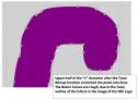 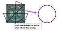 Date: 07/31/22 23:59 Re: BN(SF) 40’ COIL CARe car (Part 12) – NSC Logo Author: tmotor Add them all together, and a pretty reasonable facsimile of the NSC Logo is the result. :-D
Dave Edited 1 time(s). Last edit at 08/01/22 00:00 by tmotor. Date: 08/01/22 19:49 Re: BN(SF) 40’ COIL CARe car (Part 12) – NSC Logo Author: tomd Date: 08/03/22 22:49 Re: BN(SF) 40’ COIL CARe car (Part 12) – NSC Logo Author: tmotor Greetings Tom!
> Awesome work! Thanks! I am inspired by your level of ability to create artwork for decals. :-D The more I work with Inkscape, the more I am impressed by its functionality. For free software, it is quite powerful. Some folks said it will crash on occasion. I haven't had that problem, but then again I'm probably not pushing it to its limits. Regardless, I save-off work quite often, just in case. Take care and God bless! Dave Edited 2 time(s). Last edit at 08/03/22 22:50 by tmotor. |