| Home | Open Account | Help | 251 users online |
|
Member Login
Discussion
Media SharingHostingLibrarySite Info |
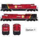
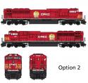
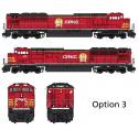
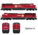
Western Railroad Discussion > New CPKC Livery OptionDate: 06/02/23 04:43 New CPKC Livery Option Author: zorz As per an Facebook discussion, employees are voting on the next paint scheme from these five options.
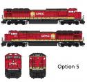
   Date: 06/02/23 04:44 Re: New CPKC Livery Option Author: zorz Options 4 & 5
  Date: 06/02/23 05:12 Re: New CPKC Livery Option Author: Spoony81 #3 I guess… they’re all pretty underwhelming IMO
Posted from iPhone Date: 06/02/23 05:14 Re: New CPKC Livery Option Author: lne655 Looks like a CP vote, lets get some ideas from the KCS folks.
Date: 06/02/23 05:25 Re: New CPKC Livery Option Author: DLM If I could stop yawning, I might pick #2. Maybe they could just go with solid red, paint a very large beaver down each side, and stacked flags for the countries they serve on the nose and tail.
Date: 06/02/23 05:46 Re: New CPKC Livery Option Author: santafe199 I'd go with #1 just to keep solid red from being quite so overbearing...
Lance/199 Date: 06/02/23 05:59 Re: New CPKC Livery Option Author: bnsf6606 Option 5 for sure. Like the black roof and extra striping similar to KCS at least
Date: 06/02/23 06:02 Re: New CPKC Livery Option Author: commissioner I'd go with 1,3 or 5.
Mark Kennebeck Saint Paul, MN Date: 06/02/23 06:04 Re: New CPKC Livery Option Author: zorz commissioner Wrote:
------------------------------------------------------- > I'd go with 1,3 or 5. I'm thinking combine 3 and 5 - the nose tripes and the upper/lower trim would be quite elegant. Date: 06/02/23 07:18 Re: New CPKC Livery Option Author: SR2 Spoony81 Wrote:
------------------------------------------------------- > #3 I guess… they’re all pretty underwhelming > IMO > > Posted from iPhone Underwhelming is most cost effective (cheap!). The dark roof will help to cover up some of the filth present on many of the CP units currently. SR2 Date: 06/02/23 07:20 Re: New CPKC Livery Option Author: SOO6617 One thing the designs show is that Canadian Pacific Kansas City
is not long for this world. The company will be soon known just by its initials "CPKC", otherwise the full name would be spelled out on the long hood in at least one version. Date: 06/02/23 07:32 Re: New CPKC Livery Option Author: dpc37 This is on the CPKC Employee Station I will be Voting not sure if I like any of them but maybe 1 or 5. David
Date: 06/02/23 07:34 Re: New CPKC Livery Option Author: baretables santafe199 Wrote:
------------------------------------------------------- > I'd go with #1 just to keep solid red from being > quite so overbearing... > > Lance/199 Agreed. They might as well borrow CSX's suitcase and be honest with the name. CP(kc) Date: 06/02/23 07:40 Re: New CPKC Livery Option Author: FiestaFoamer In order of preference, I would say 1,4,3,5,2... 5 looks good clean but I think it might look weird when the loco is faded and dirty, much like BNSF H2, which also has a fat, bright sill stripe like that. 2 is the only one I really dislike, though.
Date: 06/02/23 07:41 Re: New CPKC Livery Option Author: ts1457 None. They need a scheme with a larger proportion of black to red and maybe more yellow striping thrown in.
Date: 06/02/23 07:53 Re: New CPKC Livery Option Author: Jesse6669 In my opinion, #3 is the best-- although I'm not an employee so my vote means doodly-squat!
Date: 06/02/23 07:56 Re: New CPKC Livery Option Author: zorz Here's my proposed option 6.
 Date: 06/02/23 07:57 Re: New CPKC Livery Option Author: atx_railfan I don't hate option #3
Date: 06/02/23 08:05 Re: New CPKC Livery Option Author: mcdeo Would 3, 4, 5 look better with a yellow sill stripe? UP does it, so CPKC could.
Mike ONeill Parker, CO Date: 06/02/23 08:31 Re: New CPKC Livery Option Author: mapboy I like #4 best, but some of these are like being at the optometrist- "Which is better? "A" or "B"?"
mapboy |